Create Your First Project
Start adding your projects to your portfolio. Click on "Manage Projects" to get started


Fall 2024 - Leverage Data for Organizational Results - Predictive Models for Workforce Attrition
Project Type
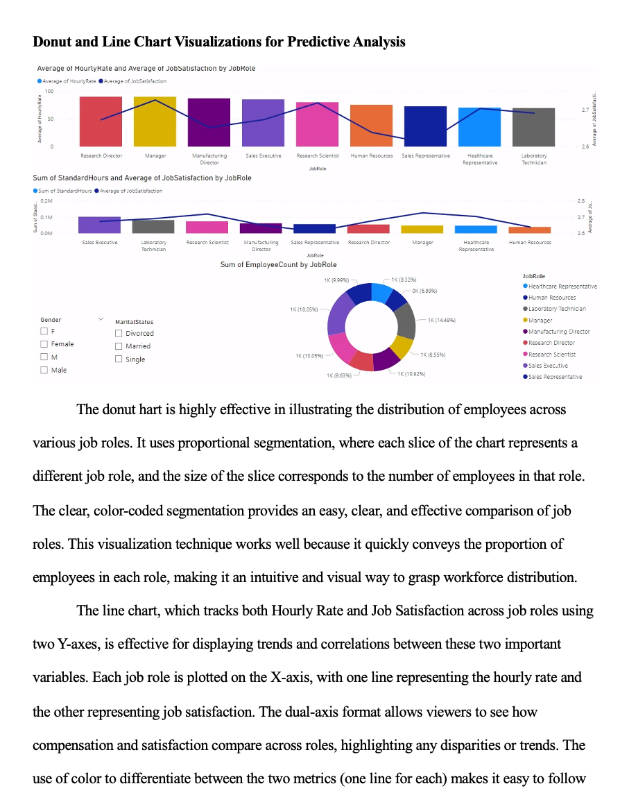
Visualizing Predictive Models for Workforce Attrition Analysis
Date
Fall 2024
📊 Visualizing Predictive Models for Workforce Attrition Analysis
Course: Leverage Data for Organizational Results (DAT-430)
Term: Fall 2024
Tools Used: Power BI, Predictive Modeling, Donut Charts, Line Charts
Project Overview
This project focused on demonstrating the value of predictive visualizations in answering real organizational questions through clear, accessible dashboards. Using Power BI, I designed and interpreted visualizations that forecasted employee attrition trends in a fast-growing organization. The assignment emphasized how predictive models can transform raw data into strategic insights for stakeholders — even those with limited technical backgrounds.
Key Visualizations:
Donut Chart: Showed the distribution of employee count across job roles
Dual-Axis Line Chart: Compared average hourly rate and job satisfaction by job role
These visualizations were part of a dashboard designed to help stakeholders understand where attrition risk was highest and how factors like compensation and job satisfaction varied across the organization.
Purpose & Insight:
Donut Chart: Illustrated workforce distribution by role, enabling HR teams to spot which departments were most vulnerable to attrition or in need of resource reallocation. When filtered by demographics, it also supported diversity and inclusion analysis.
Line Chart: Revealed disparities between hourly wage and job satisfaction. For example, some roles showed high pay but low satisfaction — a signal that compensation alone wasn’t solving retention challenges.
These visuals helped uncover critical predictors of turnover, such as misalignment between employee value perception and their compensation or recognition.
What I Learned:
How to use visual storytelling to communicate complex data relationships to non-technical audiences
The strategic role of predictive models in solving organizational problems like attrition and workforce planning
The importance of choosing the right visual format (e.g., donut vs. line) for the intended message and stakeholder group
Reflection:
This project reinforced that data visualization isn’t just about making graphs — it’s about making sense. I learned how to frame predictive insights in a way that supports real-world decisions and empowers organizations to act with foresight rather than hindsight. It deepened my confidence in building visual tools that bridge the gap between raw data and human understanding.